
UN Agency Intranet
Reimagining of an internal knowledge portal.
The Product
UNOPS, a UN agency, has approximately 7,000 colleagues who work on around 1,000 projects a year in around 100 countries around the world. Many of these locations are in some of the world's most challenging contexts. As the organisation is a project based organisation colleagues join and leave as projects start and end.
The Ask
To support this UNOPS need an easy to use means of retrieving important information as and when needed. It's vital that this means is usable without onboarding both for product consumers and producers.
Interestingly one of the KPIs identified by the product owner was to increase the number of visits, whilst at the same time decreasing the amount of time taken to successfully retrieve information. This was a large departure from the previous iteration where longer visit times were seen as desirable.
Another key requirement for the project was to decrease territorialism and competition over Intranet pages as part of an overall desire to reduce the amount of time spent on creating content.
The Solution
A minimal design product that is focused on content delivery over ornamentation. The product is highly attuned to being accessible using techniques to limit line length for readability, adaptive font sizes based on the available screen space that are clamped to avoid too much variance and the usual attention to the WCAG standards.
The product leverages the organisation's investment in the Google Workspace ecosystem by integrating with Google Directory (people), Google Drive (documents) and Google Cloud Search (search). It's also integrated with the organisational data warehouse for further enrichment of people in the search.
Leaning on learnings from building the organisational website the product followed some of the same patterns.
The product is built upon Craft CMS and has Atomic Design principles at its very core. This combinations allows for highly flexible "builders" that allow our content creators to assemble content from a selection of discrete building blocks that offer a wide degree of variation within the minimal design approach.
The approach taken for hosting the site was also a radical departure from previous work, with a containerised approach running on Google Kubernetes Engine (GKE) as well as utilising caching and a CDN. This approach gives an elastic and resilient product which scales to meet demand, self heals in the event of issues and allows for zero downtime product releases.
The Project
The project was couched in the terms of an innovation project which set out with the goal of replace a UN agency's (UNOPS) Intranet with a new product whilst reimagining the culture of production, management and consumption of content.
Closed innovation was adopted, contact with external bodies constituted fact-finding rather than collaboration. Collaboration occurred within UNOPS but this aligned with multidisciplinary participation rather than open innovation.
Various perspectives were considered when understanding the innovations type to be attempted:
- Replacing/upgrading an incumbent system was viewed as sustaining, whereas radical changes to platform type was considered modular.
- Changes to the culture content architectural and a broadened readership (new markets) disruptive.
Approach
The approach was modelled on the Gartner method shown below.
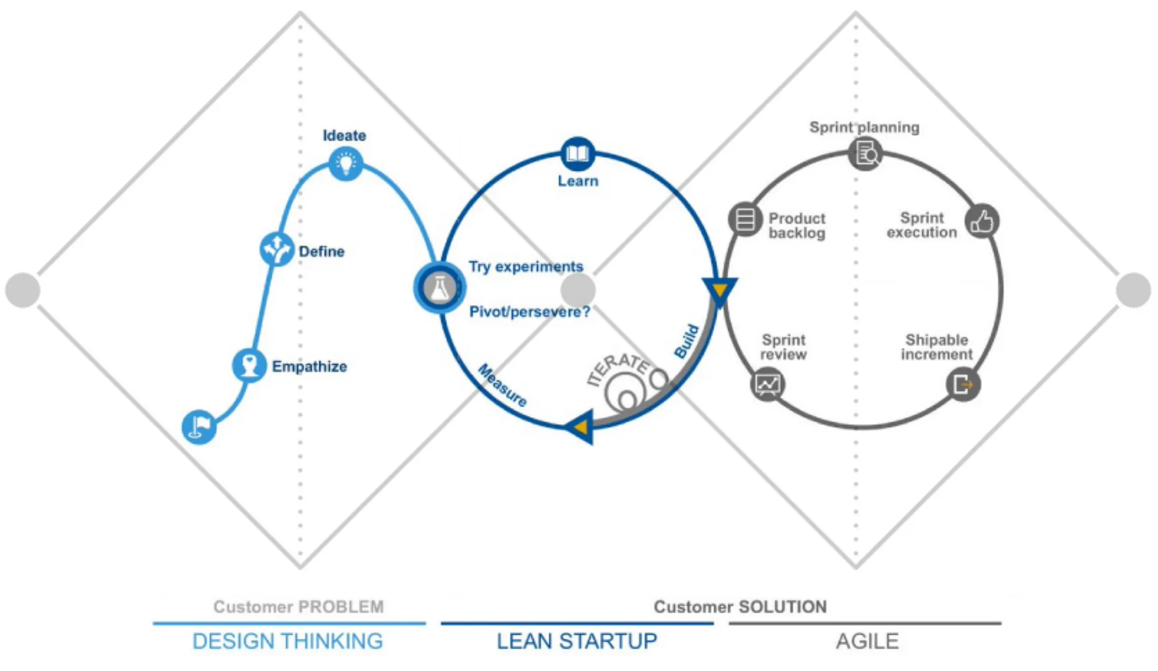
Additionally Design Sprints would be used at a tactical level within the Lean Startup iterations.
Team Formation
The project team had no previous professional history so the team canvas approach was used to bootstrap a productive culture quickly. The result of this was an agreed team purpose that would be used as a touchstone throughout the project.
Empathise
21 semi-structured user interviews were undertaken following the Harvard D.School method Interview For Empathy. Audio recordings of these interviews were made for subsequent analysis.
Statistical analysis of content consumption on the incumbent product, was undertaken using data from Google analytics.
Interviews and demonstrations were sought with comparable teams, peer organisations and industry leaders.
There was a further gathering and review of industry best practices in this field.
Define
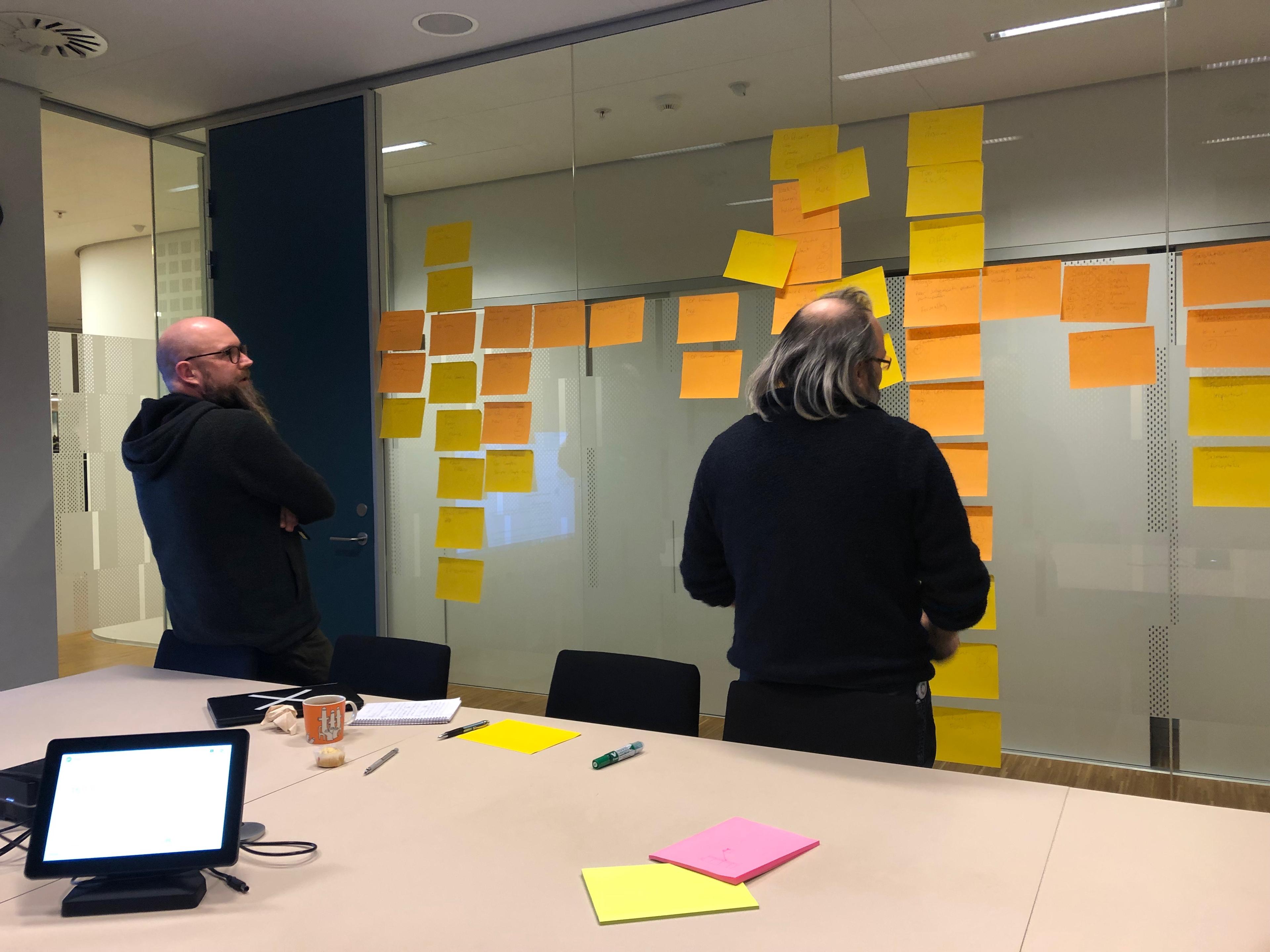
The project team undertook analysis, breaking down larger concepts, and synthesis - reassembling our conclusions.
The interview recordings were analysed garnering insights.
It was noted that some interviewers displayed bias in interviews and “defended” incumbent product shortcomings. This was highlighted, discussed and they resolved to mitigate this.
Insights were clustered into key-insights:
- News.
- Landing page.
- Document management.
- Governance.
- Content creation.
- Search.
- Navigation.
- Gamification.
- Portal.
Key-insights which required further exploration were identified, respecting project context and organisational boundaries, arriving at a shortlist.
- Landing page.
- Gamification.
- Content creation.
- Navigation.
- Multilingual - added by team.
- Search.
The need for further exploration necessitated a second Empathise iteration.
Empathise
This iteration was shorter with less participants, activities included:
- 10 user interviews.
- Statistical analysis, verification of assertions made to date.
- Renewed contact with peer organisations.
Participants were interviewed on individually selected key- insights.
Trigger materials, paper based prototyping kits, were introduced for abstract topics.
As before, the interviews were recorded.
Define
As with the previous iteration analysis and synthesis was undertaken, digesting and reconstituting learnings.
Ideate
A vision document (problem definition) and an abbreviated “pitch-deck” to sell the idea to key stakeholders were created.
We encountered unexpected resistance from a key stakeholder on the vision’s concepts of personalisation and democratisation of communication channels.
An unfortunate decision was taken overriding findings on these key-points.
As these were key-points of the vision we pivoted, iterated the vision and documented this as business requirements (project brief).
Within the team, there was some reflection that this decision compromised some of the key tenets of the original vision, putting the “desirability” of the product at risk.
Experiments
The team organised a number of workshops to co-create prototypes with end-users.
The workshops used aspects of the Design Sprints methodology - in particular lightning demos, crazy 8’s, solution sketches, art gallery, dot voting and rapid prototyping.
Workshops held:
- Hub
- Navigation
- News
- Search
- Page Layout
Hub
The Hub is the starting point of the Intranet. During the workshop paper prototypes where created. These were explored in the Art Gallery without explanation and critiqued by the participants. A high fidelity, code-based, prototype was created using the best features of the proposed prototypes.
Navigation
Navigation was highlighted as one of the major weaknesses of the incumbent Intranet, accordingly extra attention was paid and in all ten workshops were held. An initial multi-business unit workshop decided upon topics, which the following nine workshops explored.
This resulted in four prototypes:
- V1 - Low Fidelity. Paper. Test nested approach.
- V2 - Low Fidelity. Paper. Test generic navigational paths.
- V3 - Low Fidelity. Paper. Test specialist navigational paths.
- V4 - High Fidelity. Digital. Digital creation & testing.
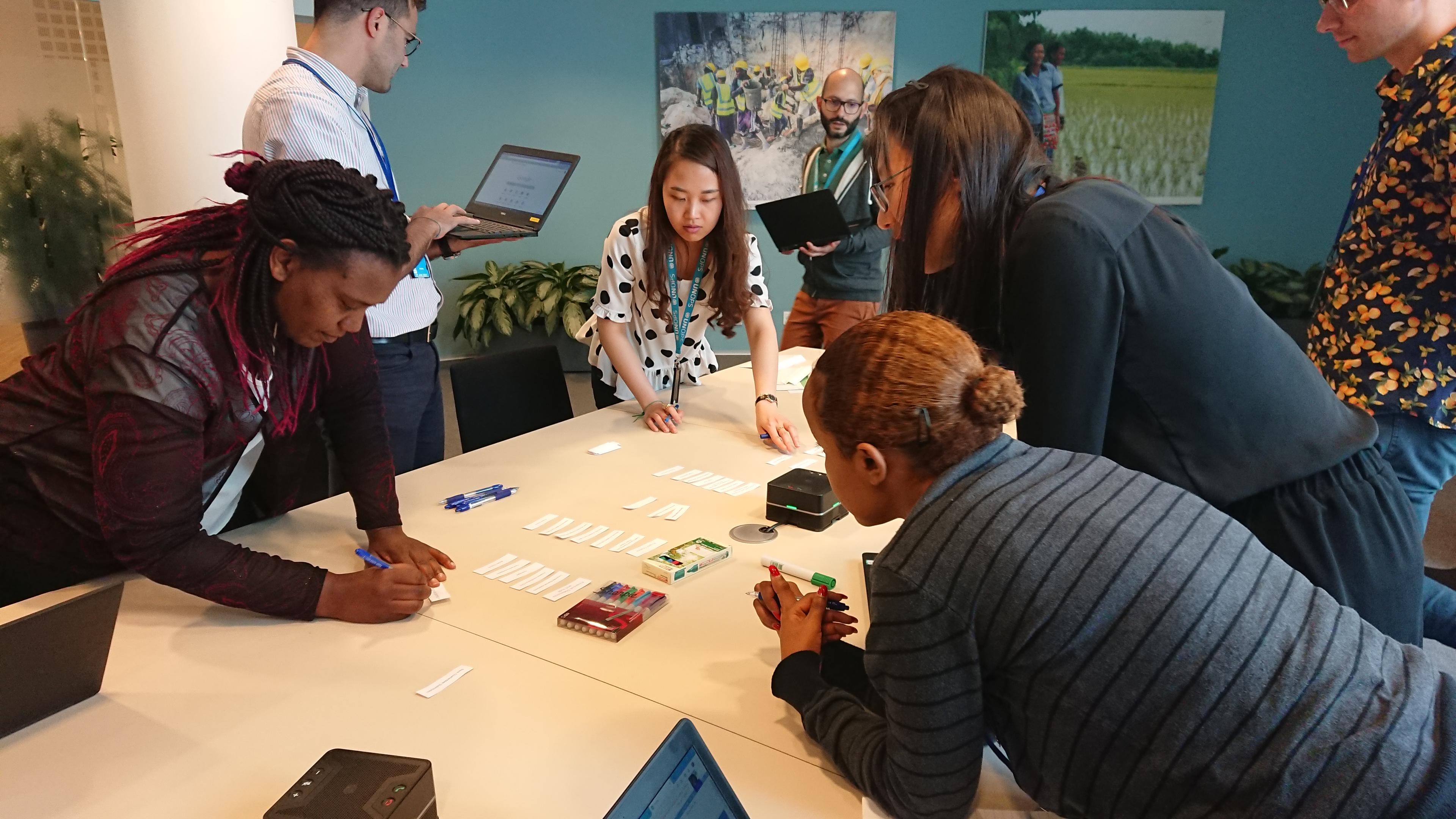
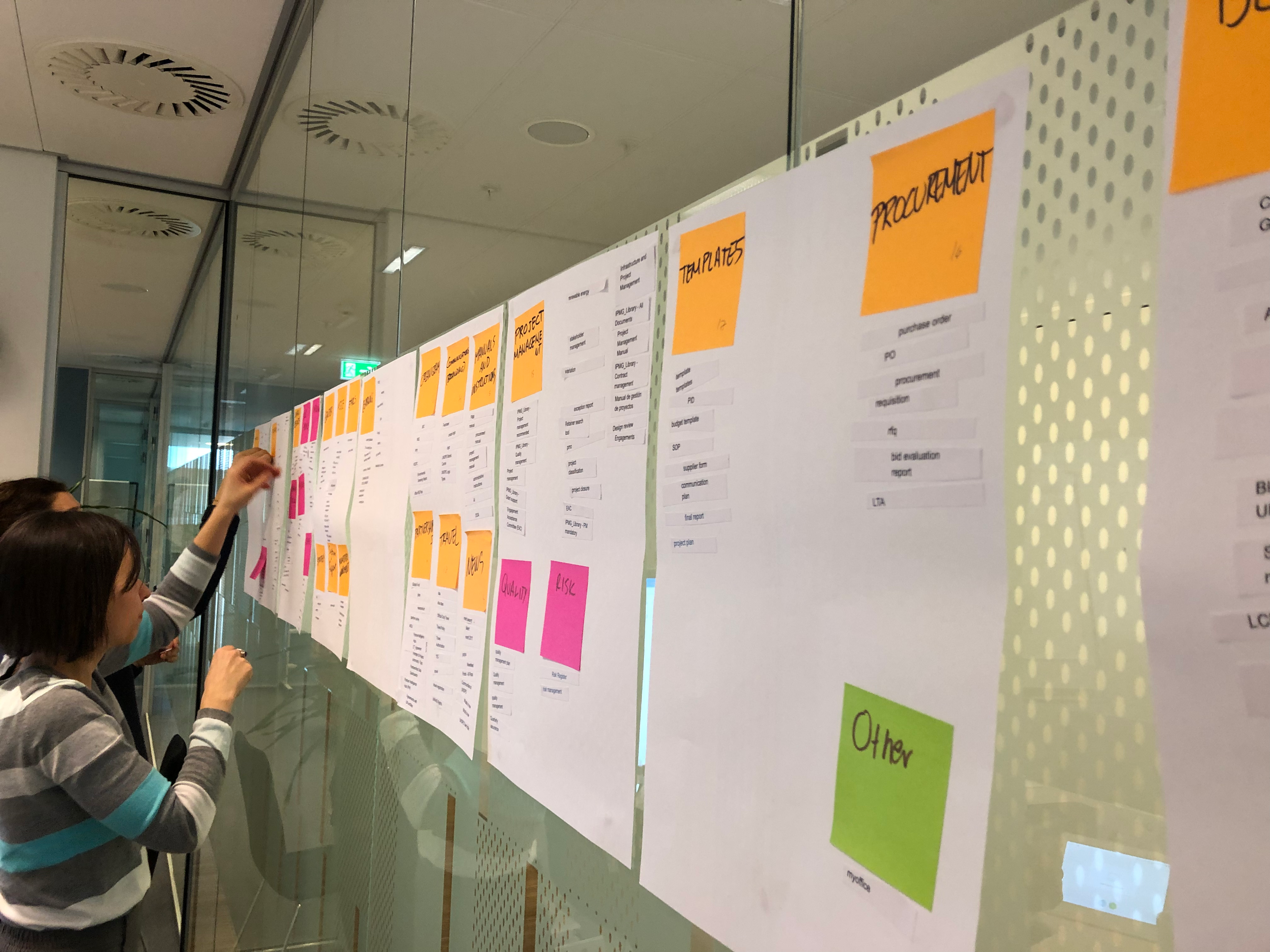
Notes & learnings from the prototypes:
- V1 - learnings, paper prototype too fragile.
- V2 - adopted spray glue approach for robust paper prototypes.
- V3 - co-creation and testing with business units on topics they “own”.
- V4 - creation of code based prototype for digital testing.
Page Layout
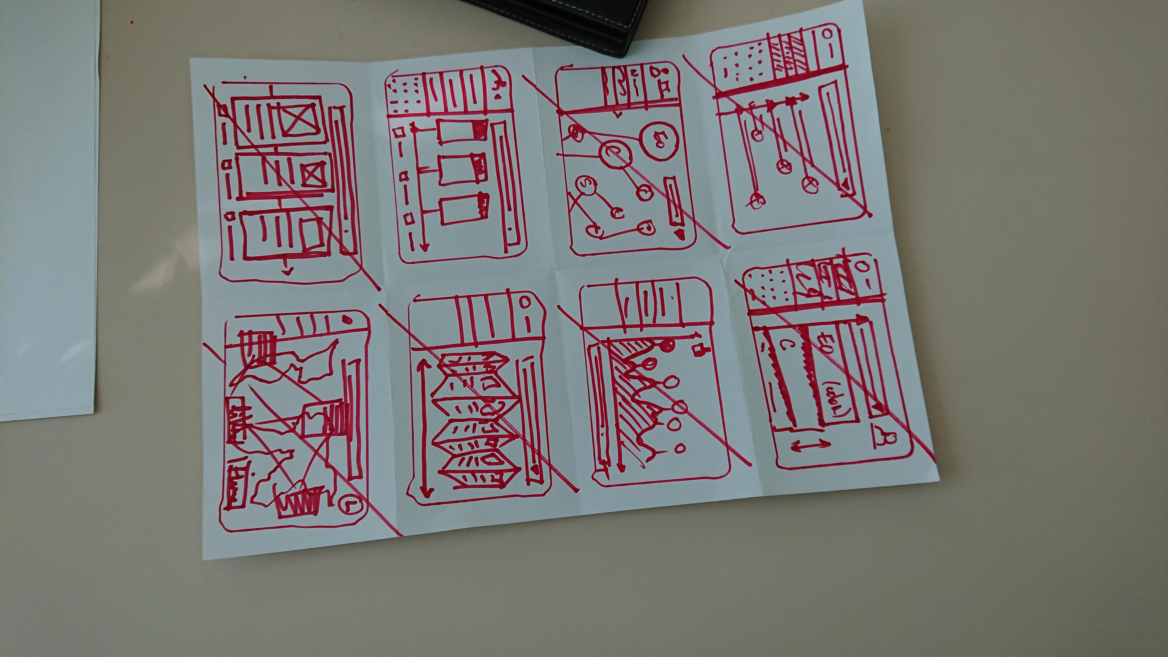
This workshop was not entirely successful. Whilst there was a plurality of ideas, many were outlandish with questionable benefits or too difficult to implement.
On reflection it was handled badly, we asked too much of the participants who were working beyond their skill sets. Nevertheless, key features were used as content building blocks used to build the prototypes.
Prototypes V1-V4 were a collaboration in Figma between the project team and UNOPS graphic designers. Each iteration was reviewed and critiqued by both teams before feedback from peers was sought and incorporated in subsequent iterations.
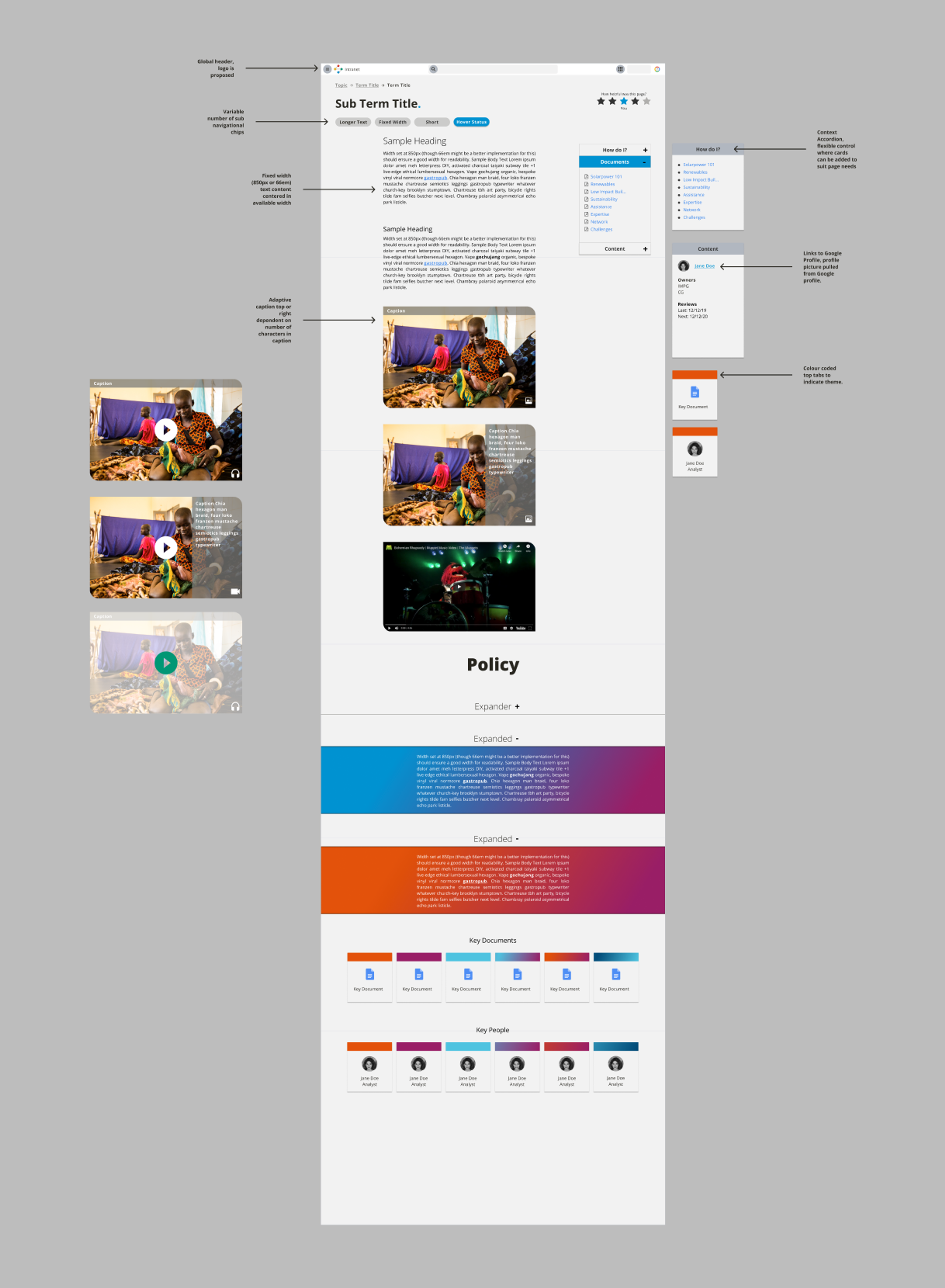
The iterations tend towards an easier parsed single column without sidebars.
Following feedback, flat colours were removed to prevent business unit territorialism over colour, the use of gradients and subtler colouring is attempt to reduce this.
News
The news section had its own layout workshop which was attended by remote participants via Google Meet. This made crazy 8’s, solution sketches and dot voting, quite difficult. Workarounds were improvised with photo sharing by remote participants and proxy actions in the room both being quite helpful. However, further investigation and consideration on how to undertake Design Sprints style workshops with remote participants would be valuable.
Search
The workshop followed a similar model to the other workshops. Building a prototype for search was challenging as we were constrained to use Google Cloud Search due to the need to surface documents from Google Drive in the search results. This was problematic as Google pushed back the release date of Google Cloud Search a number of times during the project with it becoming available a very short time before launch.
Ethics
Stringent efforts were made to ensure that the team and extended participants were as representative and diverse as was practical.
A geographic bias, peculiar to UNOPS, where colleagues from headquarters have an undue influence on IT systems specification and creation was addressed.
The team was a multinational, multi-disciplinary, gender balanced selection of individuals with a good age spread. Interviewed users represented a good balance of age, ethnicity, gender, seniority and geographic location.
However ethics were compromised to some extent by political realities and the overriding of findings by powerful stakeholders.
Reflection
On reflection, the process had positives and negatives. Participants, both within and out with the team, felt empowered and engaged. Engagement levels of the participants out with the team were particularly surprising. Identifying this early the team reciprocated and kept participants fully informed of progress. This was reinforcing and provided the project with a wide group of advocates within the organisation.
Unsurprisingly the process highlighted that incumbents feel threatened by change, particularly when the change threatens their self worth or perceived organisational worth.
More negatively, it was evident that powerful stakeholders can distort the outcome; this has been identified by other practitioners of Design Thinking and is highlighted by Iskander in HBR -
“The solutions that win out are not necessarily the best — they are generally those that are favored by the powerful or at least by the majority.”
The products themselves have been well received by the organisation and participants in the process. The feedback on the thoroughness of process and quality of the products has been extremely good.
Reflecting on what could have been better immediately after the project it was evident that there was considerable uncertainty around the discontinuance of some previously available features of the Intranet.
Continuing to reflect on this after some time it has become clear that the uncertainty was unfounded and the appreciation of the product was initially solidified and has continued to grow over time.


